The Same Paint Colors in Different Designs
Have you ever been to a friend's house and seen a wall color you liked? However, when you tried a sample at your own home, it looked different? There are many factors to affect the way we see color. But the critical factor is the lighting, both natural and lighting from lamps, overhead, and ambient lighting sources. Let’s compare a few designs using the color paint color with an explanation of why they look different.
Paint color SW Perfect Greige
We used the same paint color in these two designs, SW Perfect Greige 6073. However, the difference between these two spaces is that in the Casual Water Project, the living room faces West, has dark brown floors, and a wall of windows with a large green lawn of grass. As a result, the paint color takes on a warm, creaming taupe color.
In comparison, the same color is in the Coastal Links Project with its blue grasscloth wallpaper and inky blue accent wall. The bedroom is North facing and with the lanai pool right outside the windows, the color reflects a cooler tone of beige.
That Perfect Neutral White
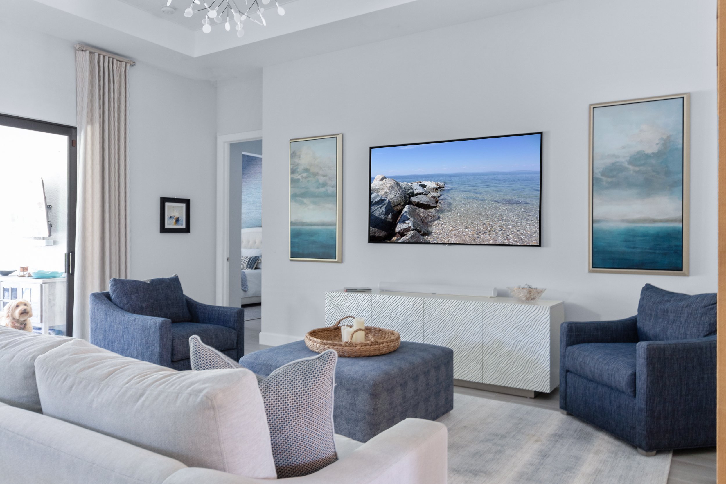
When we are looking to brighten up a space and have tile floors with yellow or pink undertones, it’s best to good with a neutral white paint color. We like SW Futon 7101. In the Coastal Links Project, we used it in the family room to brighten to space up and tone down the yellow of the existing marble floors. Notice how it brings the gray and white of the flooring into the room not the yellow.
Using the same color in the Herons Cove Project. The goal was to tone down the pink the tone of the existing tile while adding a cool neutral to the color palette. We love how the blues in this design balance with the paint color to create a soothing color scheme.
When you are thinking about Painting your Walls Gray
Do you have a space you want to paint gray, but you're afraid it may look too industrial? SW Rhinestone 7656 is one of those colors that can transform a room. We use it in homes with a lot of natural light, but we want a slight tone to the space. In Steve's Beach House Project, the home is a new construction with gorgeous honey wood floors in Bonita Spring, FL. It's on the water, so the home has blue reflected from the water into the space. This color creates the perfect gray neutral for the Great Room Design.
To enhance the brightness of this living room design. The color SW Rhinestone has a high light reflective value (LRV) of 76, which helps create a soft and bright interior. Additionally, the house features a large pool, and the blue water reflects into the room.
Is it time to bring in the professionals?


